Design & Style Guide for Beth Wonson Branding
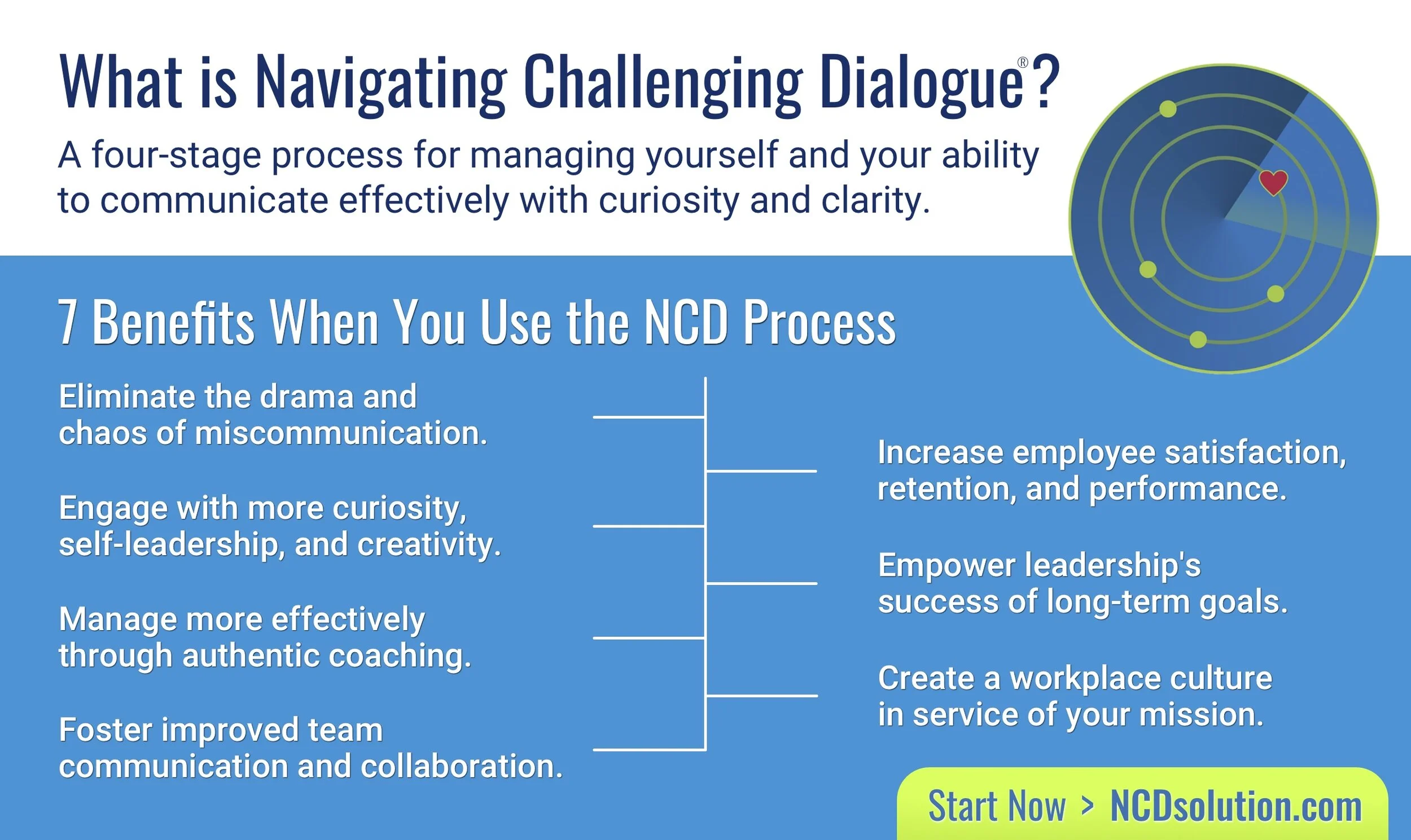
A four-stage process for managing yourself and your ability to communicate effectively with curiosity and clarity.
Navigating Challenging Dialogue® is a Registered Mark of Beth Wonson & Company. At least the first instance of “Navigating Challenging Dialogue®” in a document must have our ® mark.
STYLE GUIDE
Ahas (as in “Aha!”) is always lowercase and italicized. Take care to remove Beth’s inevitable apostrophes and replace her Ah-ha.
Shoulds is always lowercase and italicized. Take care to remove Beth’s inevitable apostrophes.
Paragraphs should always use a style that includes at least 6 pt (usually 12 pt) of space after the paragraph. And never use 2 paragraph returns anywhere in the document. (IOW, never press the Enter Key twice).
For marketing, use NCDsolution.com (which will resolve to http://Navigating Challenging Dialogue.com)
NCDprocess.com is the online classroom.
The URLs http://Navigating Challenging Dialogue.com http://NCDsolution.com and http://NCDprocess.com all should have the “N”, "C", and "D" capitalized. The "www" is not used on our site. ALSO, in many contexts (like in emails and PDFs, you MUST include the http:// or the the URL will not be clickable.
For marketing purposes, use http://NCDsolution.com
In Social Media posts, all # should have the first letter of each word capitalized (this is for ADA screen reader compatibility).
Accessibility and Readability are our Priority
Text on backgrounds should always be high-contrast. IOW, on dark backgrounds, text should be white or light-colored. Text on light-colored-backgrounds should be black or OUR Brand gray, blue, or red. The color gray is reserved for non-critical text (people need the info, but it's not the emphasis.)
All Videos should have properly formatted and edited Captions
All embedded Images should have properly formatted "Alt Text".
TYPEFACES
These are the typefaces we use for Beth Wonson materials and marketing.
Headline Font: Oswald [Download]
Color Palette
Logo/Primary
rgba(040, 102, 161, 1.000)
HEX #2866A1
rgba(159, 200, 072, 1.000)
HEX #9FC848
rgba(088, 089, 090, 1.000)
HEX #58595A
rgba(192, 042, 070, 1.000)
HEX #C02A46
Accent/Secondary
rgba(016, 045, 138, 1.000)
HEX #102D8A
rgba(206, 254, 080, 1.000)
HEX #80DEFF
rgba(000, 149, 216, 1.000)
HEX #0095D8
rgba(077, 184, 255, 1.000)
HEX #4DB8FF
rgba(098, 173, 054, 1.000)
HEX #62AD36
rgba(255, 224, 012, 1.000)
HEX #FFE00C
rgba(178, 187, 197, 1.000)
HEX #B2BBC5
rgba(232, 082, 167, 1.000)
HEX #E852A7
rgba(210, 215, 221, 1.000)
HEX #D2D7DD
rgba(113, 061, 156, 1.000)
HEX #713D9C
rgba(255, 174, 000, 1.000)
HEX #FFAE00
rgba(253, 120, 002, 1.000)
HEX #FD7802
#1595BB New Blue Aug 2024
Logos and Button Images for Our Products and Services
When Creating Workbooks and Keynotes, We Typically Cross-Promote Other Products at the End.